New graphic and corporate identity of the Municipality of Monção
On March 24, 2022, the City Council of Monção, aware that to characterize a great Municipality only a great brand could do that, presented and launched the “Monção Brand” at Cine Teatro João Verde. A brand born from the forms of our cultural and built heritage, from the union and welcoming smile of our People.
The new identity of the Municipality of Monção is more than graphic. In its essence, it identifies Monção, while organizing and communicating the Municipality, bringing together the Municipal Council, its Areas of Action, Municipal Services and Equipment.
This new identity also brings with it a signature with history and for history: Monção Leaves a Mark. No matter how many times Monção is visited, Monção leaves its mark on all of them. This was the reason why the City Council decided to choose this signature, with the aim of communicating it to everyone and everywhere.
As a unique territorial brand, with a contemporary expression, which asserts an evident reality, the “Monção Brand” assumes itself not only as a true positioning instrument, but also presupposes an evolution in communication and in the way Monção interacts with residents and visitors.
Being fully capable of identifying Monção, in a unique and incomparable way, this brand was created to last in time as an element of differentiation and affirmation. Undoubtedly, to affirm Monção as a global brand.
Client
- Municipality of Monção
Year
- 2022
Description
- Branding & Identity
Intervention
- Graphic Design
- Editorial Design
- Illustration
- Event Design
- Art Direction
Monsoon, the reason that brings us here
Monção is Monção. Not everything, but much more than just one thing. More than Vila Termal and Cradle of Alvarinho. It's just like us, made of paradoxes. Your way! Always with distinct and independent arguments, but with a common point: its People.
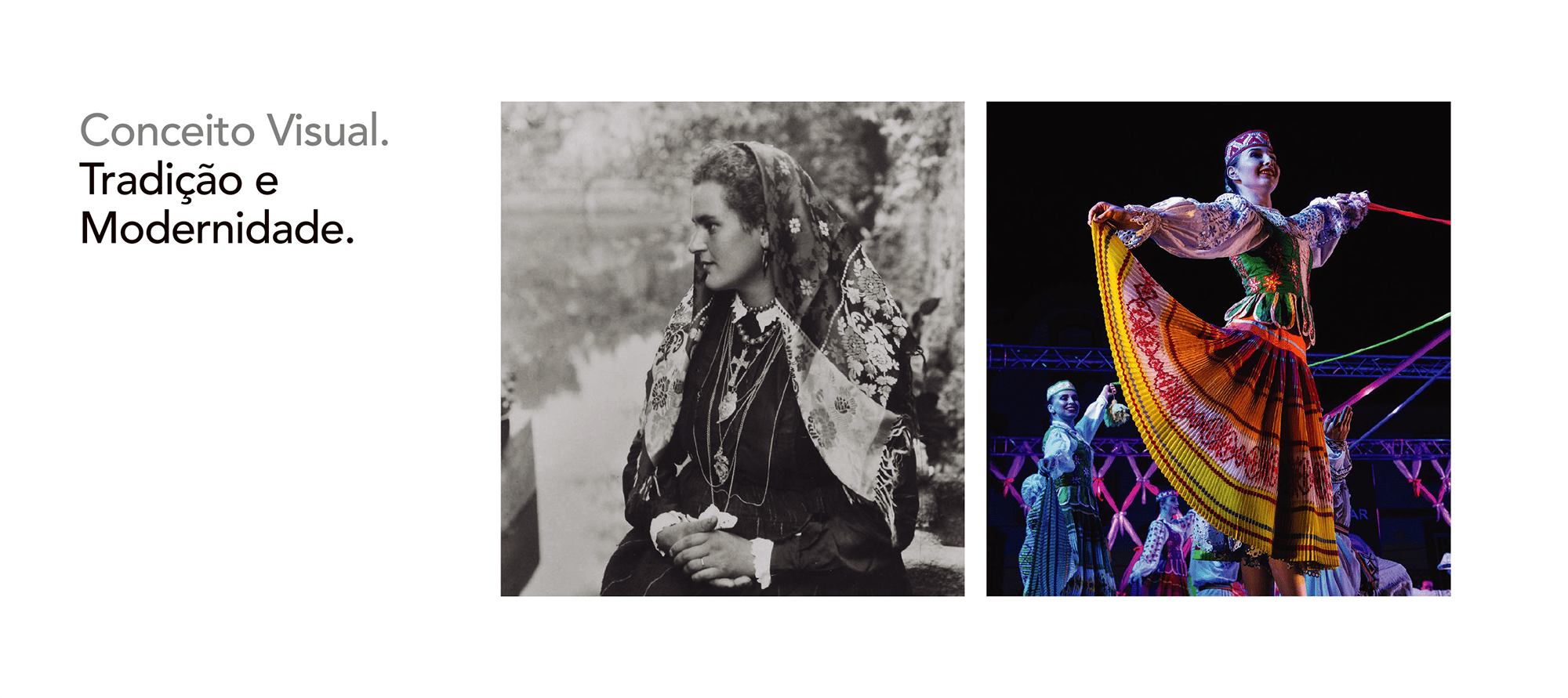
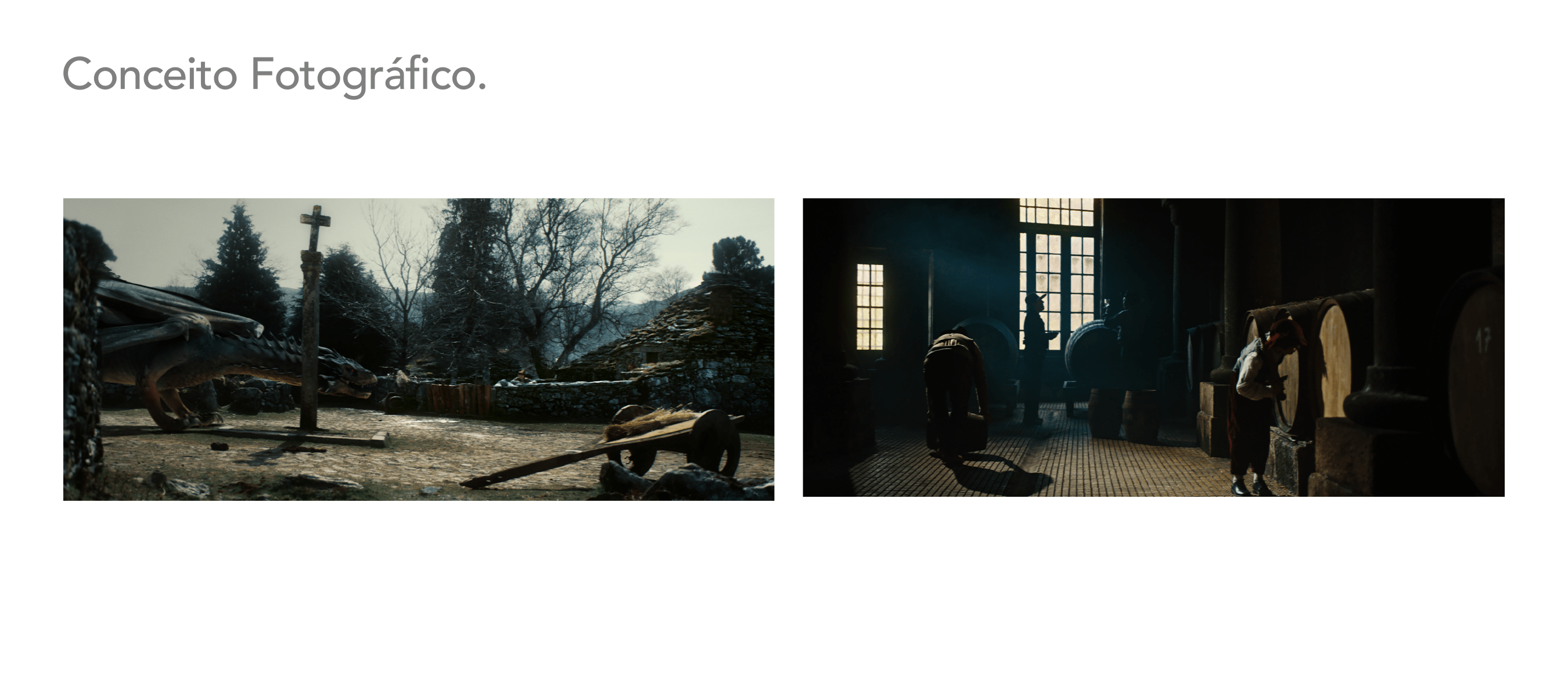
Monção is not a character, it's a stage! When it is not seen as a whole, it is felt through its traditions, its customs, its places, its landscapes and its people, which give it life and make it beautiful and fascinating.
Monção is, in its essence, its immortal Heroines and legendary Mythological Figures. Its historic center and its genuine parishes. The unique “terroir” of its unique Alvarinho and its exclusive Gastronomy. Its Thermal Waters and its attractive rivers. Its enviable Heritage and its beautiful Landscapes. Its cultural events and religious festivals. Its People, as a brand image, which makes it a unique land, one of the most beautiful lands in Portugal.


How to graphically express the future of such an old Monção?
As creators, more than that, people from Monça in heart and soul, we were challenged to create something new. To create, given the obvious need, a new identity for the Municipality of Monção. More than graphic, capable of, in essence, identifying Monção, while organizing and communicating the Municipality, bringing together the Municipal Council, its Areas of Action, Municipal Services and Equipment.
An identity obsessed with leaving a mark, as a fundamental premise, and making sure that Monção, this little corner of Minho, of endless charms, will never be the same again. Undoubtedly, stop being the same and be placed where you deserve to be.
To make a difference, we've taken everything we know. To do better, in everything they let us know. Because in fact, from those who know Monção to those who don't, passing through those who think they know it, we all have its mark, within us, and we have in its mark the mark of all of us.


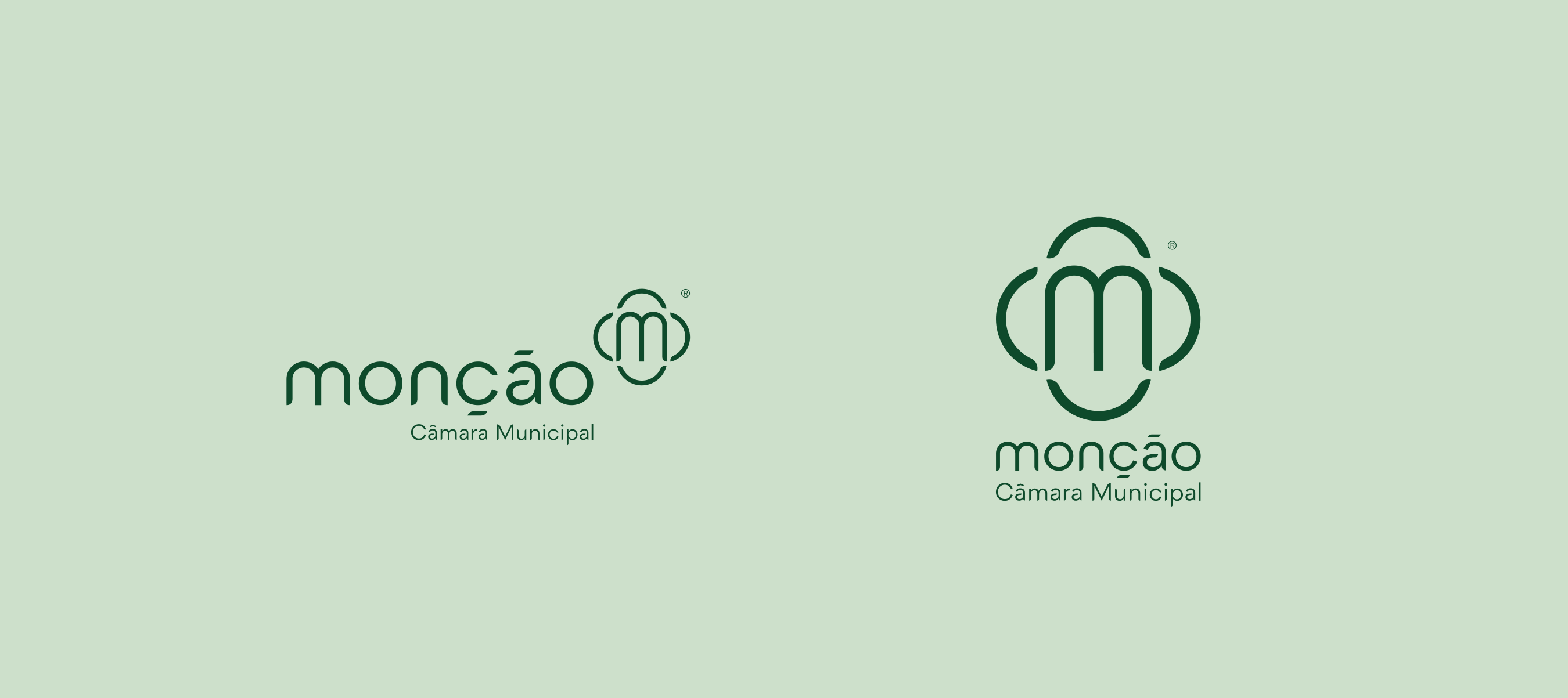
Monção brand. The symbol.
To characterize a great municipality, only a great brand. This is the Monção brand! Born from the forms of our cultural and built heritage, from the union of our People, from the welcoming smile of our People.
Our brand, being fully capable of identifying Monção, in a unique and incomparable way, was created to last in time, as an element of differentiation and affirmation.
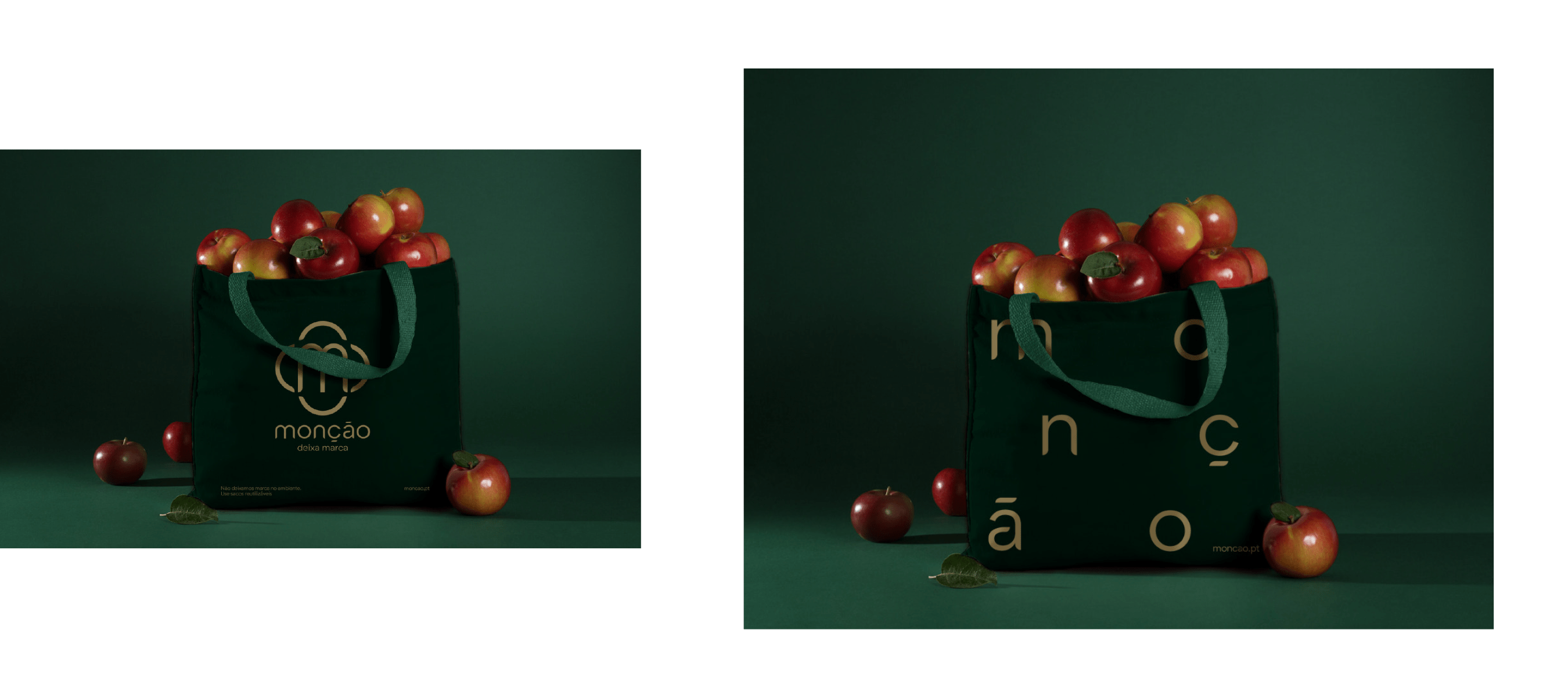
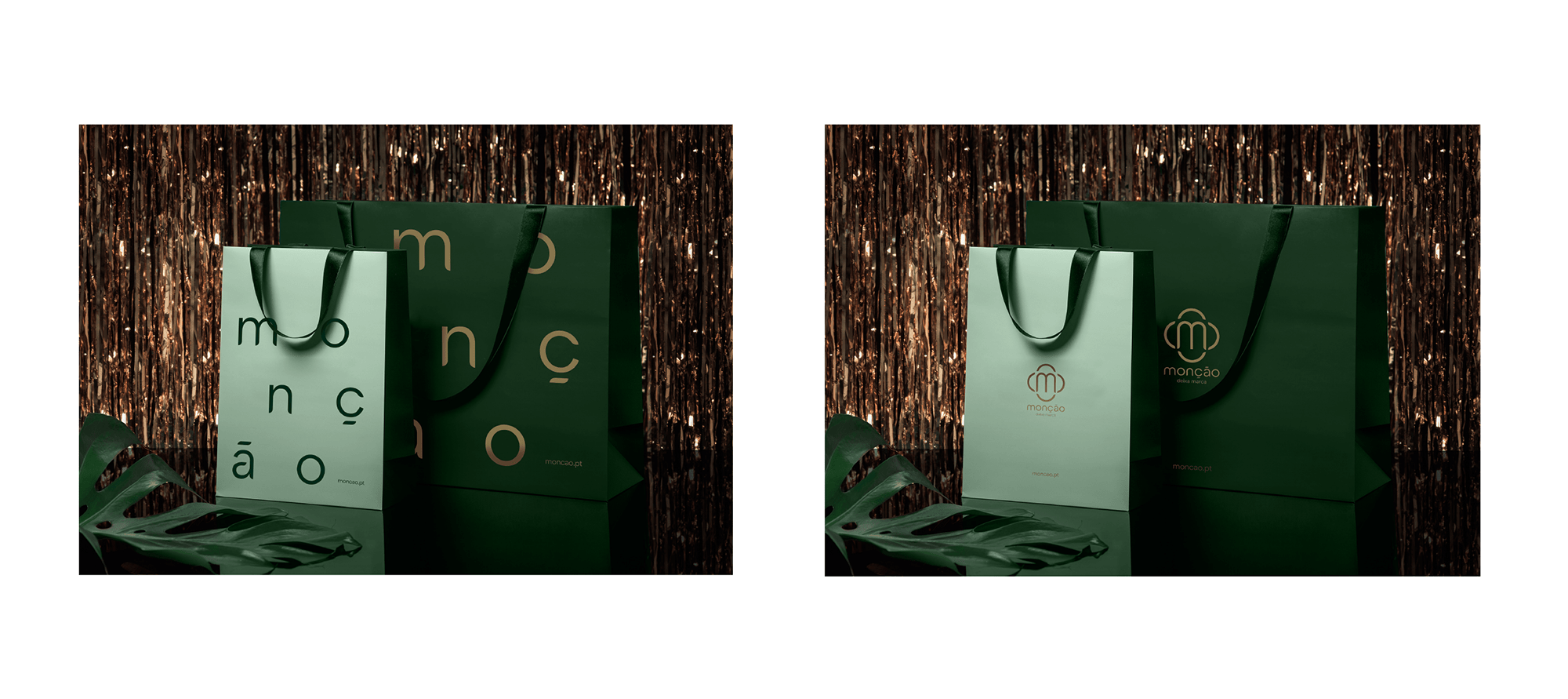
Its graphic representation, more than combining tradition and contemporaneity, and respecting history, does not abdicate the word “Monção”. In it, Monção, in its simplest and purest form, dresses in an iconic way, with its own typography (Monsans), to transmit, inside and across borders, because it leaves a mark.
A brand as a seal of quality.
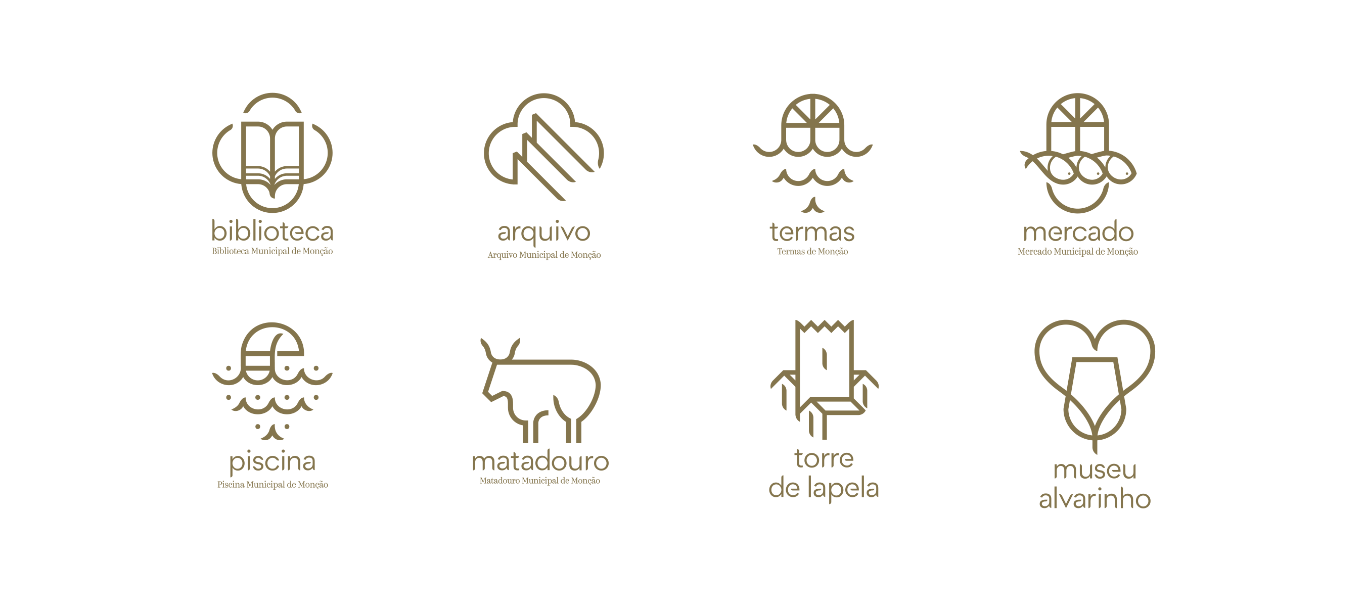
As Monção is not just Alvarinho and “Cordeiro à Moda de Monção”, the “Brand Monção” was created to have a transversal application. In addition to identifying the Municipality of Monção, the Municipal Council, its Areas of Action, the Municipal Services and Equipment, it may, if elevated to a quality seal, serve, in the future, as a guarantee of our heritage, our traditions, customs and Monçanese values and the promotion of our endogenous resources, thus enabling the identification of our products/services, as well as our tourist offer.


One claim with history and for history.
Monção leaves its mark. No matter how many times Monção is visited, Monção leaves its mark on all of them. Hand in hand with tradition and contemporaneity, this was the reason why we decided to choose this signature, with the aim of communicating it to everyone and everywhere.

A new Positioning, even more differentiating.
Presenting itself as a unique territorial brand, of contemporary expression, which affirms an evident reality – “Monção leaves its mark” – the “Marca Monção” assumes itself as the true positioning instrument of the Municipality.
By sacrificing the previous signature, “Vila Termal. Berço do Alvarinho.”, the new signature, “Monção leaves a mark”, with a broader focus and a new approach, which involves all the areas and actors of the Municipality, presupposes an evolution in communication and in the way in which the Municipality interacts with its stakeholders. residents and visitors. All this will be taken into account and will inspire what will be done in the future.


A brand with value and Values.
The Monção Brand is:
Authentic. Much more, it has a unique style, it is exclusive. Taking into account a certain number of existing cases around the world, it is not cliche let's talk about it;
Simple. In all its essence and expression. In identity, in speech, in image, in communication;
Courageous. It shows what we are made of and identifies us by calling things by name. “Coca de Monção”, for example, are more than just names, they are part of us, of our Monçanese essence.
Respectful of history. It not only respects history, but recreates and reinterprets it, valuing cultural heritage, know-how and the people;
Affective. Because Monção truly leaves its mark. See, feel and believe;
Versatile. Or inexhaustible, given the ease of use, in all senses of its communication.
Proud. Proudly parochial, out of affection and never out of limitation to the land. We want to be a global brand, open to new risks and challenges.


Client: Municipality of Monção
Year: 2022
Art Direction: MarkaBranka
Graphic Design: Fabio Alves and Rafael Pereira
Copywriting: Márcio da Rocha
Motion Graphics: Creative Lemons
Video production: Stopline (Leonel Vieira)